Youth Risk Behavior Surveillances

The goal of this analysis was to understand health patterns in high schoolers from the ages of the 9th to the 12th grade. The data for this analysis was taken from the Centers for Disease Control and Prevention’s annual Youth Risk Behaviour Surveillance System survey. This data is also part of the openintro library.
data(yrbss)
glimpse(yrbss)
Exploratory Data Analysis
Before beginning with the rest of the analysis, I used the skim() function to do a cursory check over the data. This gave me a better idea of the completion rate of the data.
I then plot a histogram of the weights using the geom_histogram() function, as I wanted to determine the median of the weights.
skimr::skim(yrbss)| Name | yrbss |
| Number of rows | 13583 |
| Number of columns | 13 |
| _______________________ | |
| Column type frequency: | |
| character | 8 |
| numeric | 5 |
| ________________________ | |
| Group variables | None |
Variable type: character
| skim_variable | n_missing | complete_rate | min | max | empty | n_unique | whitespace |
|---|---|---|---|---|---|---|---|
| gender | 12 | 1.00 | 4 | 6 | 0 | 2 | 0 |
| grade | 79 | 0.99 | 1 | 5 | 0 | 5 | 0 |
| hispanic | 231 | 0.98 | 3 | 8 | 0 | 2 | 0 |
| race | 2805 | 0.79 | 5 | 41 | 0 | 5 | 0 |
| helmet_12m | 311 | 0.98 | 5 | 12 | 0 | 6 | 0 |
| text_while_driving_30d | 918 | 0.93 | 1 | 13 | 0 | 8 | 0 |
| hours_tv_per_school_day | 338 | 0.98 | 1 | 12 | 0 | 7 | 0 |
| school_night_hours_sleep | 1248 | 0.91 | 1 | 3 | 0 | 7 | 0 |
Variable type: numeric
| skim_variable | n_missing | complete_rate | mean | sd | p0 | p25 | p50 | p75 | p100 | hist |
|---|---|---|---|---|---|---|---|---|---|---|
| age | 77 | 0.99 | 16.16 | 1.26 | 12.00 | 15.0 | 16.00 | 17.00 | 18.00 | ▁▂▅▅▇ |
| height | 1004 | 0.93 | 1.69 | 0.10 | 1.27 | 1.6 | 1.68 | 1.78 | 2.11 | ▁▅▇▃▁ |
| weight | 1004 | 0.93 | 67.91 | 16.90 | 29.94 | 56.2 | 64.41 | 76.20 | 180.99 | ▆▇▂▁▁ |
| physically_active_7d | 273 | 0.98 | 3.90 | 2.56 | 0.00 | 2.0 | 4.00 | 7.00 | 7.00 | ▆▂▅▃▇ |
| strength_training_7d | 1176 | 0.91 | 2.95 | 2.58 | 0.00 | 0.0 | 3.00 | 5.00 | 7.00 | ▇▂▅▂▅ |
ggplot(yrbss,aes(x=weight))+
  geom_histogram()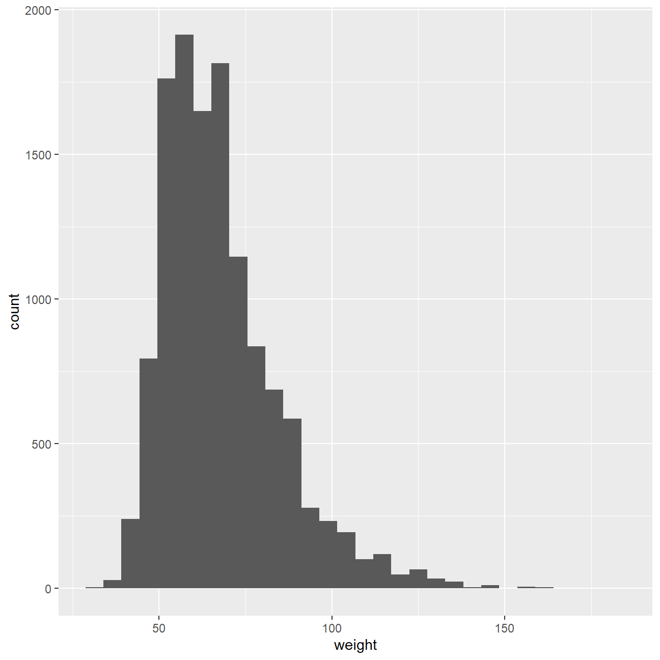
sum(is.na(yrbss$weight))## [1] 1004As part of the analysis, I wanted to determine if the weight of a high schooler and the amount of physical activity they undertook were related. To do this, I first needed to manipulate the data, such that I could have an indicator of wether they were physically active. To do this, I added a column for physical_3plus, reflecting yes if they are physically active for at least 3 days a week, and no otherwise. I then used both count() functions as well as the summarise() functions to calculate the population proportion of each group to ensure that the two methods would return the same value.
#Percent calculated by count
yrbss=yrbss %>%
  mutate(physical_3plus=ifelse(physically_active_7d>=3,"yes","no"))

yrbss%>%
  group_by(physical_3plus) %>%
  count(physical_3plus,sort=TRUE)
## # A tibble: 3 × 2
## # Groups: physical_3plus [3]
## physical_3plus n
## <chr> <int>
## 1 yes 8906
## 2 no 4404
## 3 <NA> 273#Percent calculated by group_by() and summarise()
yrbss %>%
group_by(physical_3plus) %>%
summarise(count=n()) %>%
mutate(percentage=count/sum(count))## # A tibble: 3 × 3
## physical_3plus count percentage
## <chr> <int> <dbl>
## 1 no 4404 0.324
## 2 yes 8906 0.656
## 3 <NA> 273 0.0201Once I had the population proportion calculated, I then proceeded to calculate the confidence interval for the true population proportion in the overall population.
yrbss_count=yrbss %>%
  count(physical_3plus,sort=TRUE) %>%
  mutate(total_count=sum(n)) %>%
  na.omit(yrbss$physical_3plus) %>%
  filter(physical_3plus=="no")

n=yrbss_count$total_count[1]
k=yrbss_count$n[1]
pbar=k/n
SE=sqrt(pbar*(1-pbar)/n)
E=qt(0.975,k-1)*SE
CI=pbar+c(-E,E)
CI
## [1] 0.316 0.332I then moved onto plotting a boxplot to show the weights of those who were physically active more than 3 times a week, and those who were not, so that I could gain a better sense of if there was a difference in weights between the two groups. From the boxplots, it seemed as though there was no difference in weights between the two.
yrbss %>%
  na.omit(yrbss$physical_3plus) %>%
  ggplot(aes(x=physical_3plus,y=weight))+
  geom_boxplot()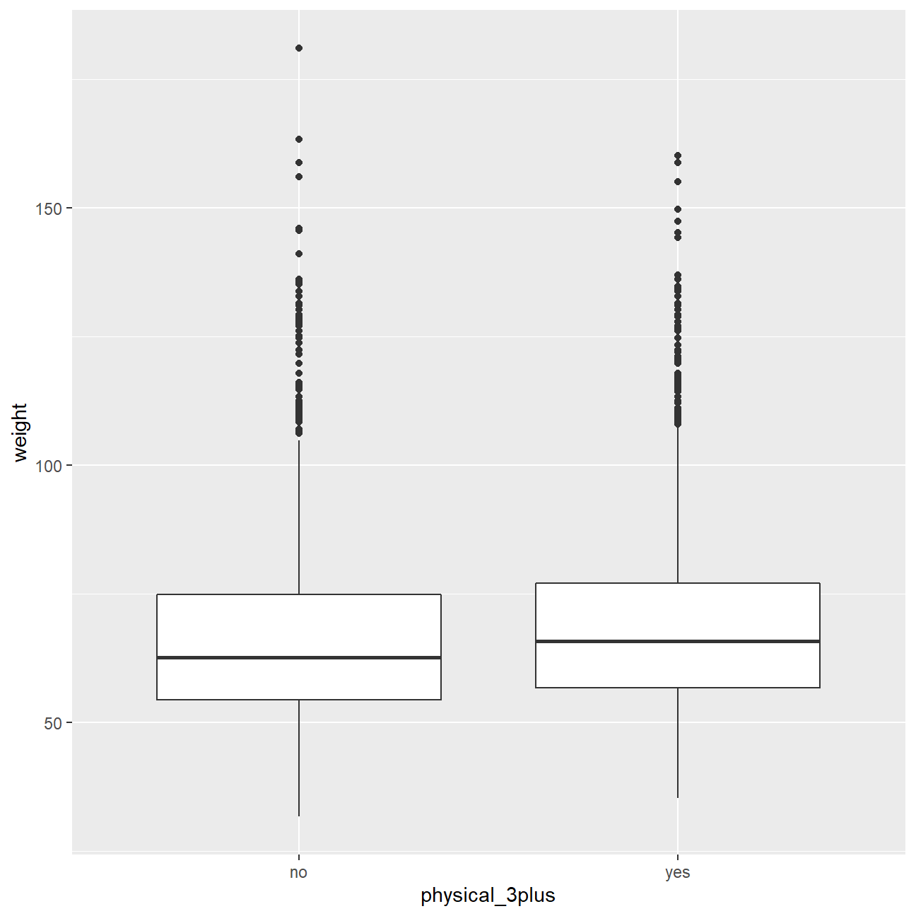
Confidence Interval
To further analyse wether the null hypothesis (that there was no difference in weight in the two groups), was correct, I calculated the confidence interval for both groups. My analysis revealed that the 95% confidence interval of average weight for the two groups did not overlap, revealing that the null hypothesis could be rejected, and that the alternate hypothesis that there was a difference in average weights could be accepted.
yrbss %>%
  group_by(physical_3plus)%>%
  na.omit(yrbss$physical_3plus) %>%
  summarize(mean_weight = mean(weight,na.rm=TRUE),
            sd_weight = sd(weight),
            count=n(),
            t_critical = qt(0.975, count-1),
            se_weight = sd_weight/sqrt(count),
            margin_of_error = t_critical * se_weight,
            net_weight_high = mean_weight + margin_of_error,
            net_weight_low = mean_weight - margin_of_error)
## # A tibble: 2 × 9
## physical_3plus mean_we…¹ sd_we…² count t_cri…³ se_we…⁴ margi…⁵ net_w…⁶ net_w…⁷
## <chr> <dbl> <dbl> <int> <dbl> <dbl> <dbl> <dbl> <dbl>
## 1 no 67.1 18.0 2656 1.96 0.349 0.684 67.8 66.5
## 2 yes 68.7 16.4 5695 1.96 0.218 0.426 69.1 68.3
## # … with abbreviated variable names ¹mean_weight, ²sd_weight, ³t_critical,
## # ⁴se_weight, ⁵margin_of_error, ⁶net_weight_high, ⁷net_weight_lowAnother method I used was to conduct a t-test using the t.test() function, with the null and alternate hypotheses remaining the same. The results as shown below confirmed that the null hypothesis could be rejected, as the t-value was smaller than -2, the p-value was smaller than 0.05, and the 95 percent confidence interval for the difference in mean weight between the two groups did not include 0.
t.test(weight ~ physical_3plus, data = yrbss)##
## Welch Two Sample t-test
##
## data: weight by physical_3plus
## t = -5, df = 7479, p-value = 9e-08
## alternative hypothesis: true difference in means between group no and group yes is not equal to 0
## 95 percent confidence interval:
## -2.42 -1.12
## sample estimates:
## mean in group no mean in group yes
## 66.7 68.4Another method used to test the hypothesis is with the infer package.
To start, I first set up the initial values, saved as the obs_diff object. As in this case the calculation being carried out was to find the difference in means, I used the stat = “diff in means” argument in calculate()
yrbss=yrbss %>%
  na.omit(yrbss$physical_3plus)

obs_diff <- yrbss %>%
  specify(weight ~ physical_3plus) %>%
  calculate(stat = "diff in means")
After the set up, I then simulated the test.
null_dist <- yrbss %>%
  # specify variables
  specify(weight ~ physical_3plus) %>%

  # assume independence, i.e, there is no difference
  hypothesize(null = "independence") %>%

  # generate 1000 reps, of type "permute"
  generate(reps = 1000, type = "permute") %>%

  # calculate statistic of difference, namely "diff in means"
  calculate(stat = "diff in means", order = c("yes", "no"))
Once the data had been simulated, I used the geom_histogram() function to visualise it.
ggplot(data = null_dist, aes(x = stat)) +
  geom_histogram()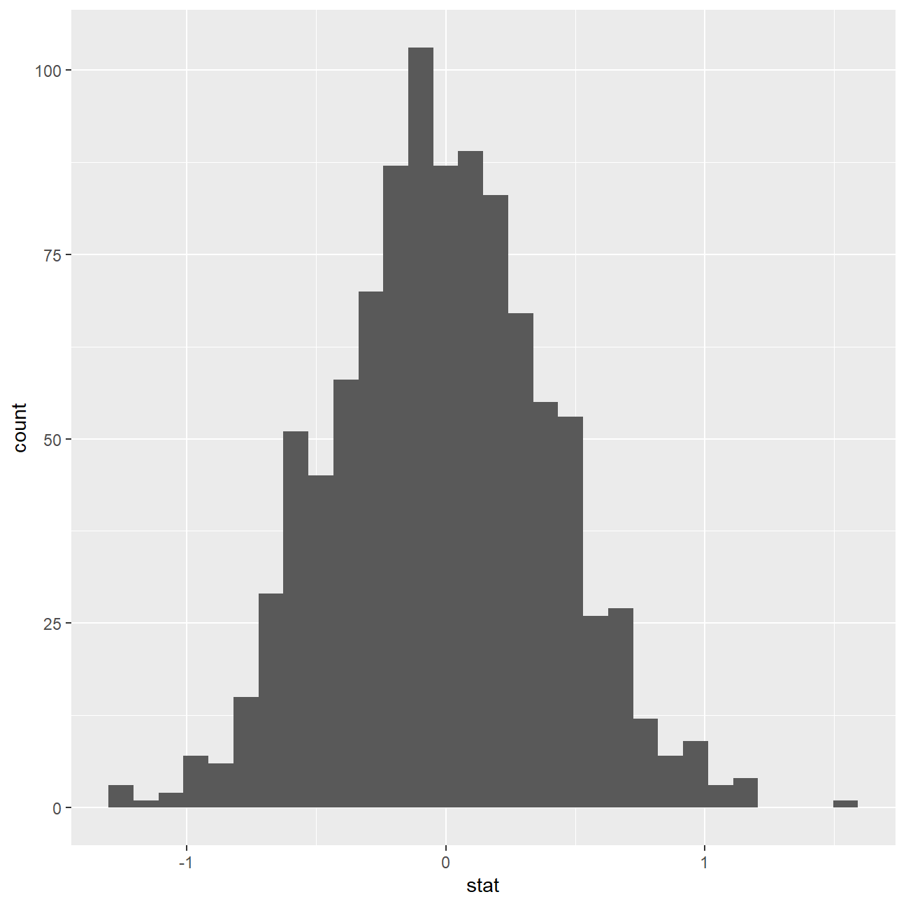
After running the test, I wanted to add visualtions for the p-value, both in calcualting it and shading it into the graph.
null_dist %>% visualize() +
  shade_p_value(obs_stat = obs_diff, direction = "two-sided")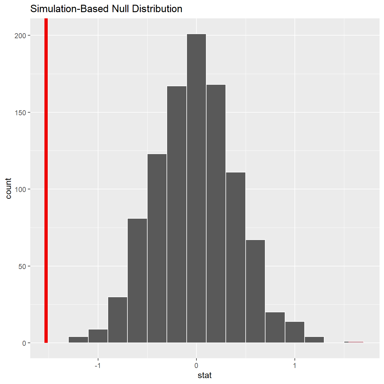
null_dist %>%
  get_p_value(obs_stat = obs_diff, direction = "two_sided")
## # A tibble: 1 × 1
## p_value
## <dbl>
## 1 0This the standard workflow for performing hypothesis tests.