Changes in Tfl Bike rentals from 2016-2022

Excess rentals in TfL bike sharing
For this task, I attempted to analyse Tfl bike data to determine how the number of bikes rented in the years 2017-2022 differed from the average rentals in 2016-2019, on a monthly and weekly basis.
First, i downloaded the data from the london.gov.uk website, then read the data into a dataframe
url <- "https://data.london.gov.uk/download/number-bicycle-hires/ac29363e-e0cb-47cc-a97a-e216d900a6b0/tfl-daily-cycle-hires.xlsx"

httr::GET(url, write_disk(bike.temp <- tempfile(fileext = ".xlsx")))
bike0 <- read_excel(bike.temp,
sheet = "Data",
range = cell_cols("A:B"))After reading the data into the dataframe, I used the clean_names() function to convert all names to use lowercase instead of uppercase letters, and to convert all spaces into underscores. I then split the year, month and week from the day field, as it was originally stored as one date field (day).
bike <- bike0 %>%
  clean_names() %>%
  rename (bikes_hired = number_of_bicycle_hires) %>%
  mutate (year = year(day),
          month = lubridate::month(day, label = TRUE),
          week = isoweek(day))
The first graph I wanted to produce was to show the changes in the average number of bikes rented on a month to month basis, from 2017-2022, in comparison to the average in years 2016-2019. In order to achieve this, I first found the mean for each month, then found the monthly mean for years 2017-2019.
After finding these, I plot the two values against one another using geom_line(), in order to have a visual representation of which was higher. Geom_line() was chosen as it would produce a line connecting all points, instead of producing a best fit line. In this way, the trend from point to point could be more closely observed. To further aid in the comparison, I shaded the area between the two lines, with green representing when the monthly average was higher than the monthly average for 2016-2019, and red representing when it was lower. This was done using two ribbons from geom_ribbon(), one where the minimum was the monthly mean for 2017-2022, and one where the minimum was the monthly mean for 2016-2019. For both of these ribbons, the maximum value was taken as the higher of the pair of values, using the pmax() function.
bike2 <- bike %>%
  filter(year>2015) %>%
  group_by(month,year) %>%
  mutate(month=match(month,month.abb)) %>%
  summarize(monthly_mean = mean(bikes_hired))

bike_2016_to_2019 <-bike %>%
    filter(2015<year & year<2020) %>%
    group_by(month) %>%
    mutate(month=match(month,month.abb)) %>%
    summarize(monthly_mean_2016_2019 = mean(bikes_hired))

bike_merged<-merge(x=bike2,y=bike_2016_to_2019,by="month") %>%
  filter(year>2016)

bike_longer<-bike_merged %>%
              pivot_longer(cols=3:4,
                           names_to="type",
                           values_to="n")


ggplot(data=bike_merged, aes(x=month)) +

  geom_line(aes(y=monthly_mean)) +
  geom_line(aes(y=monthly_mean_2016_2019), colour='blue',size=1) +
  geom_ribbon(aes(x=month,
                   ymin = monthly_mean,
                   ymax = pmax(monthly_mean,monthly_mean_2016_2019),
                   fill = "red"),
                   alpha=0.1) +
  geom_ribbon(aes(x=month,
                   ymin = monthly_mean_2016_2019,
                   ymax = pmax(monthly_mean,monthly_mean_2016_2019),
                   fill = "green"),
                   alpha=0.1) +

    scale_x_continuous(breaks = seq_along(month.abb),
                        labels = month.abb) +

    scale_fill_manual(values=c("green", "red"), name="fill") +

    guides(linetype = "none", fill = "none") +
    labs(title = "Monthly changes in Tfl bike rentals", subtitle = "Change from monthly average shown in blue and calculated between 2016-2019",
         x='', y='Bike Rentals', caption = "Source: Tfl, London, Data Store") +

    theme(legend.position = 'none') +
    facet_wrap(~year)+
    theme_minimal()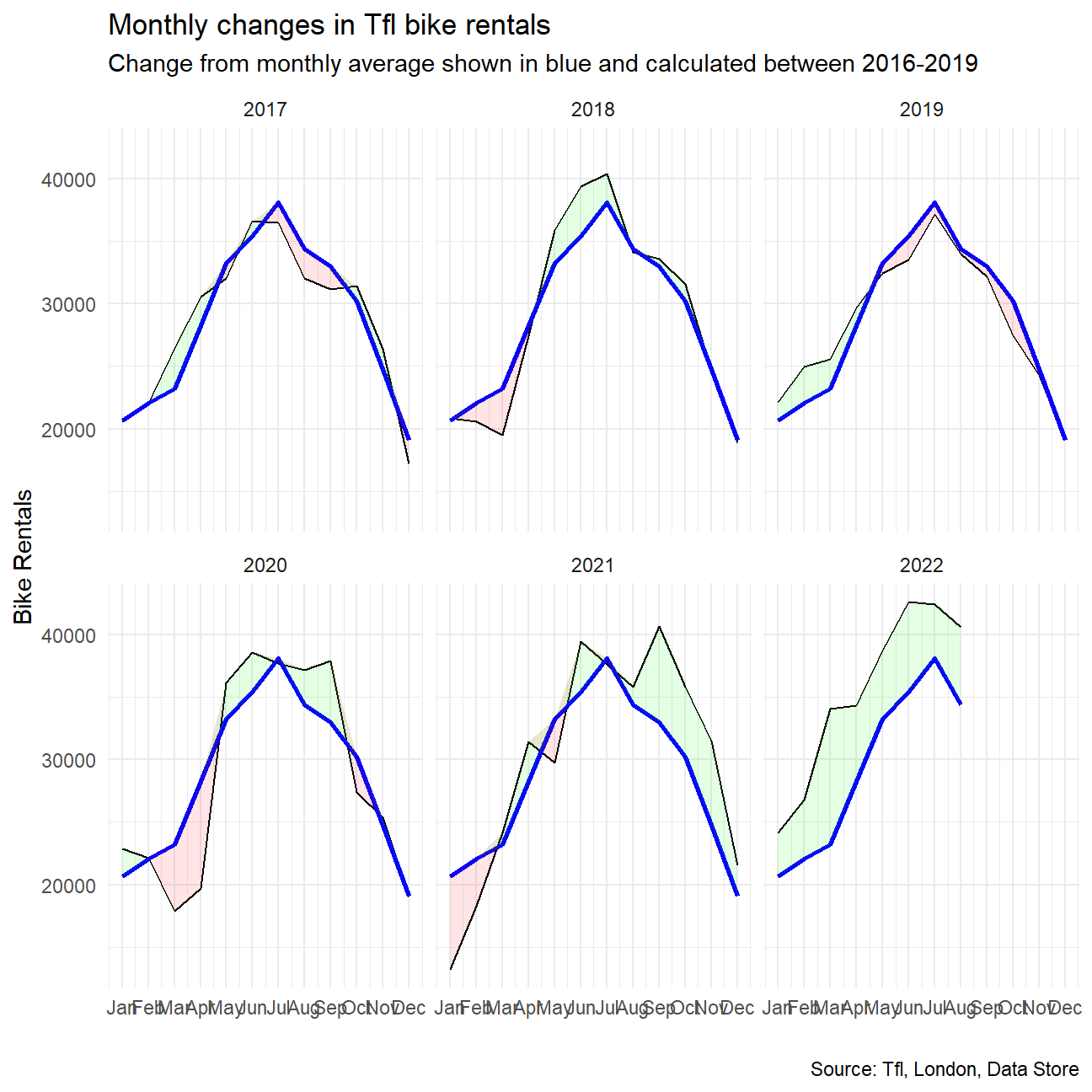
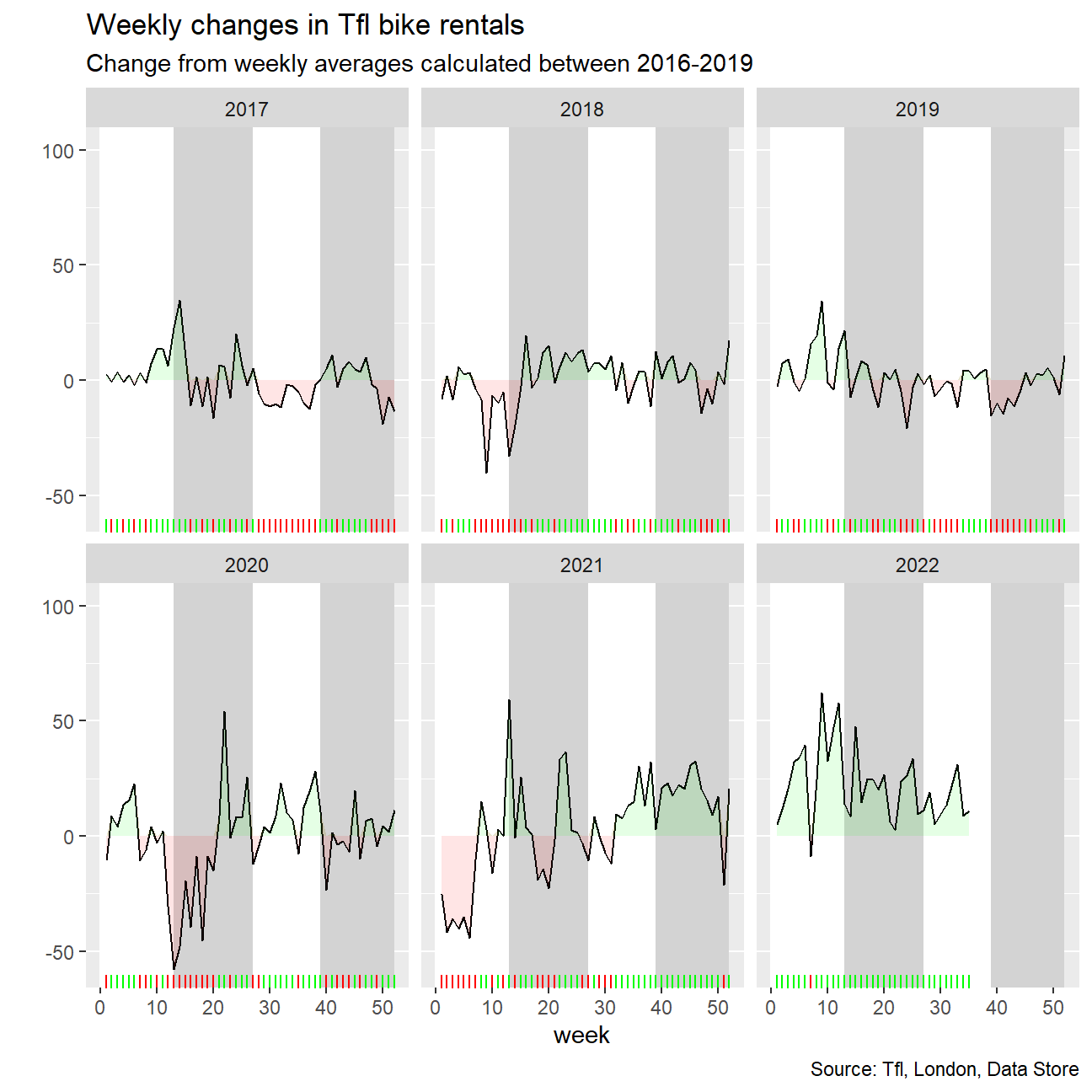
The second graph I wanted to produce was to show the changes on a week on week basis for 2017-2022, once again comparing against the average for the same week across 2016-2019. In this instance however, instead of plotting the data as two separate lines, I instead plot only the percentage change, with the weekly mean from 2016-2019 being taken as the base amount.
In this instance, I first used summarize() to summarize the data by weeks instead of months, then mutated the data to have an extra column with the calculated percentage change using mutate(). I then plot the graph as a line graph using geom_line(), and used two ribbons, one green and one red, in order to shade areas where the value was above or below 0% change respectively. In order to add legibility to the graph, I also used geom_rect() to add alternating grey and white rectangles to denote chunks of 13 weeks, and used geom_rug() to add a rug at the bottom of the graph, where the colours matched the colour of the shaded area in the graph.
bike3 <- bike %>%
  mutate(month=match(month,month.abb)) %>%
  filter(!(month==1 & week == 52)) %>%
  filter(year>2015) %>%
  group_by(week,year) %>%
  summarize(weekly_mean = mean(bikes_hired))


bike_weekly_2016_to_2019 <- bike %>%
    filter(2015<year & year<2020) %>%
    group_by(week) %>%
    summarize(weekly_mean_2016_2019 = mean(bikes_hired))

bike_weekly_merged<-merge(x=bike3,y=bike_weekly_2016_to_2019,by="week") %>%
  filter(year>2016) %>%
  mutate(pct_change_weekly = (weekly_mean/weekly_mean_2016_2019-1)*100)


ggplot(data=bike_weekly_merged, aes(x=week)) +

  geom_rect(aes(xmin = 13, xmax = 27, ymin = -Inf, ymax = Inf), fill="light gray") +

  geom_rect(aes(xmin = 39, xmax = 52, ymin = -Inf, ymax = Inf), fill="light gray") +

  geom_rect(aes(xmin = 0, xmax = 13, ymin = -Inf, ymax = Inf), fill="white") +

  geom_rect(aes(xmin = 27, xmax = 39, ymin = -Inf, ymax = Inf), fill="white") +

  geom_line(aes(y=pct_change_weekly)) +

  geom_ribbon(aes(x=week,
                   ymin = 0,
                   ymax = pmax(0, pct_change_weekly)),
                   alpha=0.1, fill='green') +

  geom_ribbon(aes(x=week,
                   ymin = pct_change_weekly,
                   ymax = pmax(0, pct_change_weekly)),
               alpha=0.1, fill='red') +

  guides(linetype = "none", fill = "none") +

  labs(title = "Weekly changes in Tfl bike rentals", subtitle = "Change from weekly averages calculated between 2016-2019", x='week', y='', caption = "Source: Tfl, London, Data Store") +

  theme(legend.position = 'none') +
  facet_wrap(~year)+
  scale_fill_manual(values=c("green", "red"), name="fill") +
  geom_rug(aes(color=case_when(pct_change_weekly>0~"red",
                               pct_change_weekly<0~"green"))
            ,sides="b") +

  scale_color_manual(values=c("red", "green"), name="color") +

  xlim(0,52) +

  NULL