GDP components over time and among countries
For this project, I wanted to analyse GDP data, to study the trends in the components of it, primarily for India, Germany, and the United States.
UN_GDP_data  <-  read_excel(here::here("data", "Download-GDPconstant-USD-countries.xls"), # Excel filename
                sheet="Download-GDPconstant-USD-countr", # Sheet name
                skip=2) # Number of rows to skip
In order to accurately used the data, I first converted it into a tidy format using the pivot_longer() function. This was necessary as the original data had one row for each component of GDP per country, with each year being a column. This format would not have allowed me to create the necessary graphs, therefore it was necessary to pivot the table. After doing this, I manipulated the data such that the value would be in millions, and only the selected countries would be reflected.
tidy_GDP_data <- UN_GDP_data %>%
  pivot_longer(cols=4:51,
               names_to = "Year",
               values_to = "value")
glimpse(tidy_GDP_data)
## Rows: 176,880
## Columns: 5
## $ CountryID <dbl> 4, 4, 4, 4, 4, 4, 4, 4, 4, 4, 4, 4, 4, 4, 4, 4, 4, 4, 4,…
## $ Country <chr> "Afghanistan", "Afghanistan", "Afghanistan", "Afghanista…
## $ IndicatorName <chr> "Final consumption expenditure", "Final consumption expe…
## $ Year <chr> "1970", "1971", "1972", "1973", "1974", "1975", "1976", …
## $ value <dbl> 5.56e+09, 5.33e+09, 5.20e+09, 5.75e+09, 6.15e+09, 6.32e+…country_list <- c("United States","India", "Germany")
tidy_GDP_data<-tidy_GDP_data %>%
filter(Country==country_list) %>%
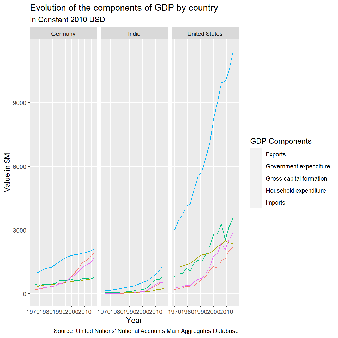
mutate(value=value/10^9)The first plot I wanted to produce was one showing Exports, Gross capital formation, Government expenditure, Household expenditure, and imports over time for each of the countries. In order to display this, I first needed to determine which rows were for which component of GDP.
To achieve this, I used the grepl() function to determine if any of the Indicator names supplied matched keywords from the GDP components. This was so I could account for any cases where there were multiple Indicator names that referred to the same overall component. I then mutated to add an extra column for the component name.
I then plot the values using geom_line() to show the changes over time.
tidy_GDP_for_graph1 <- tidy_GDP_data %>%
  mutate(components_of_GDP=case_when(
    grepl("Exports",IndicatorName) ~ "Exports",
    grepl("Gross capital formation",IndicatorName) ~ "Gross capital formation",
    grepl("Government",IndicatorName) ~ "Government expenditure",
    grepl("government",IndicatorName) ~ "Government expenditure",
    grepl("Household",IndicatorName) ~ "Household expenditure",
    grepl("household",IndicatorName) ~ "Household expenditure",
    grepl("Imports",IndicatorName)~"Imports"
  )) %>%
  mutate(Year = as.integer(Year)) %>%
  na.omit(components_of_GDP)

ggplot(tidy_GDP_for_graph1,
       aes(x=Year,y=value,color=components_of_GDP))+
  geom_line(aes(group=components_of_GDP))+
  facet_wrap(~Country)+
  labs(
    title = "Evolution of the components of GDP by country",
    subtitle = "In Constant 2010 USD",
    caption = "Source: United Nations' National Accounts Main Aggregates Database",
    color = "GDP Components",
    x = "Year",
    y = "Value in $M"
  )
While the first graph plot indicated the components of GDP, another piece of information given in the table was the actual total GDP amount. As such, my next goal was to calculate the difference in the recorded GDP, and my calculated GDP, where the calculated GDP is the sum of Household Expenditure, Government Expenditure, Gross Capital Formation, and Net Exports (Exports - Imports).
To do this, I first used pivot_wider() to convert the data. As the data originally had each component in separate rows, I used pivot_wider to convert each component into a column, with there being one row for each year and country. Following this, I was then able to mutate the data to calculate the GDP for the year. Once this was done, I was then able to use the left_join() function to add the recorded GDP to the table, allowing me to carry out the final calculation of the percentage difference between the calculated and recorded amounts.
tidy_GDP_for_graph1 %>%
  select(Country, components_of_GDP, Year, value) %>%
  pivot_wider(names_from = components_of_GDP, values_from = value) %>%
  janitor::clean_names() %>%
  mutate(
    net_exports = exports - imports,
    gdp = household_expenditure + government_expenditure + gross_capital_formation + net_exports
    ) -> wider_gdp

wider_gdp %>%
  select(country, year, gdp)
## # A tibble: 48 × 3
## country year gdp
## <chr> <int> <dbl>
## 1 Germany 1972 1709.
## 2 Germany 1975 1780.
## 3 Germany 1978 1991.
## 4 Germany 1981 2091.
## 5 Germany 1984 2158.
## 6 Germany 1987 2303.
## 7 Germany 1990 2591.
## 8 Germany 1993 2748.
## 9 Germany 1996 2887.
## 10 Germany 1999 3053.
## # … with 38 more rowstidy_GDP_data_for_join = tidy_GDP_data%>%
filter(IndicatorName=="Gross Domestic Product (GDP)") %>%
mutate(Year=as.integer(Year)) %>%
select(Country,Year,value)
tidy_GDP_data_comparison=left_join(wider_gdp,tidy_GDP_data_for_join,by=c("country"="Country","year"="Year"))
tidy_GDP_data_comparison %>%
mutate(percentage_change=(value-gdp)/value) %>%
select(country,year,gdp,value,percentage_change)## # A tibble: 48 × 5
## country year gdp value percentage_change
## <chr> <int> <dbl> <dbl> <dbl>
## 1 Germany 1972 1709. 1650. -0.0356
## 2 Germany 1975 1780. 1729. -0.0293
## 3 Germany 1978 1991. 1932. -0.0305
## 4 Germany 1981 2091. 2051. -0.0192
## 5 Germany 1984 2158. 2134. -0.0114
## 6 Germany 1987 2303. 2265. -0.0168
## 7 Germany 1990 2591. 2569. -0.00877
## 8 Germany 1993 2748. 2725. -0.00811
## 9 Germany 1996 2887. 2864. -0.00787
## 10 Germany 1999 3053. 3034. -0.00613
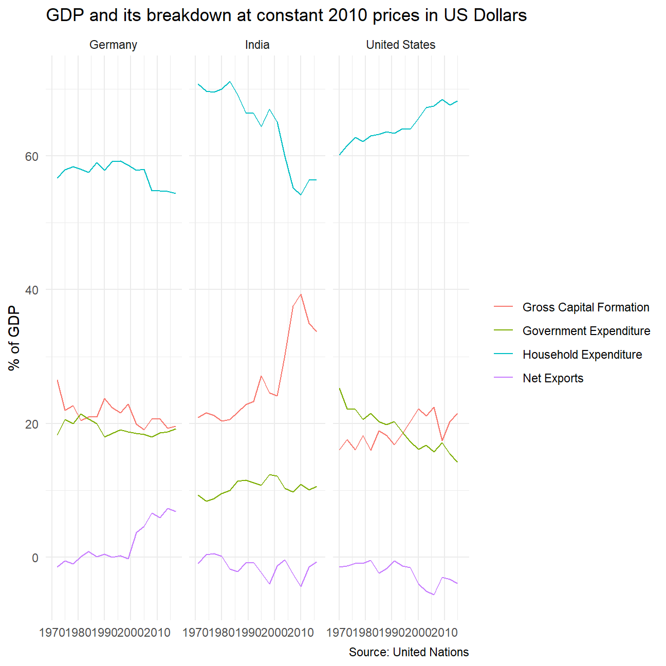
## # … with 38 more rowsTo further analyse the values, I wanted to see the percentage change over time for each component of GDP. To do this, I first used the previously created wider table to calculate the percentage of each component in GDP. After doing this, I then used pivot_longer() to convert the data back into a longer format that could be plot.
wider_gdp %>%
  mutate(
    percentage_GE = 100*government_expenditure/gdp,
    percentage_GCF = 100*gross_capital_formation/gdp,
    percentage_HE = 100*household_expenditure/gdp,
    percentage_NE = 100*net_exports/gdp
  ) %>%
  select(country, year, percentage_GE, percentage_GCF, percentage_HE, percentage_NE) %>%
  pivot_longer(cols = 3:6, names_to = "component_of_gdp", values_to = "value") %>%
  ggplot(aes(x=year, y=value, color=component_of_gdp)) +
    geom_line() +
    facet_wrap(~country) +
    theme_minimal() +
    labs(
      title = "GDP and its breakdown at constant 2010 prices in US Dollars",
      x = NULL,
      y = "% of GDP",
      caption = "Source: United Nations",
      color = NULL
    ) +
    scale_color_hue(
      labels = c('Gross Capital Formation',
                 'Government Expenditure',
                 'Household Expenditure',
                 'Net Exports'
                 )
      )